

Olympics branding has always been more than just logos and colors. It tells a story about host cities and their dreams. Every design choice sends a message to billions of viewers. But here’s what most people miss: these visual identities shape our memories of entire events.
How Olympics Branding Shapes Global Events
Think about any past Games you remember well. Chances are, specific colors or shapes come to mind first. That’s not an accident. Design teams spend years crafting these visual systems. They know something powerful: images stick in our brains longer than facts.
The best event branding creates an emotional response in seconds. It makes you feel something before you understand why. For example, warm colors suggest energy and passion. Cool tones hint at calm and precision. Every choice matters deeply.
Host cities face enormous pressure with these decisions. They’re not just representing themselves. They’re speaking to the entire world at once. A single visual system must work across hundreds of applications. From stadium signs to phone screens, consistency is key.
The Psychology Behind Color Choices
Color selection in sports branding follows careful psychological research. Different hues trigger specific emotional responses in viewers. Red increases heart rate and excitement levels. Blue builds trust and suggests reliability. However, cultural meanings vary widely across regions.
Smart designers balance universal appeal with local meaning. They test options with diverse focus groups. As a result, final palettes often surprise people. What seems obvious at first rarely survives testing. The process requires humility and openness to change.
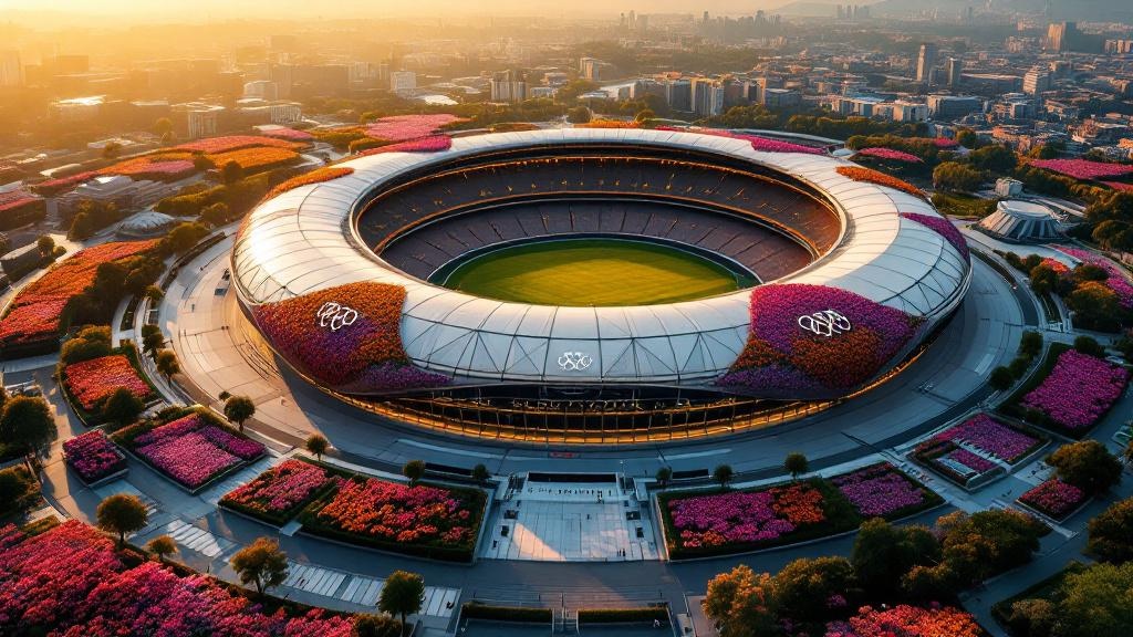
Why Nature-Inspired Design Dominates Olympics Branding
Recent years show a clear trend in event identity design. Natural elements appear everywhere in major sports branding. Flowers, leaves, and organic shapes have become popular choices. But why does nature work so well for these massive events?
The answer lies in universal appeal. Plants and natural forms cross cultural boundaries easily. Everyone understands growth and renewal. These concepts match perfectly with athletic achievement. Meanwhile, organic shapes feel fresh compared to rigid geometric alternatives.
For more insights on visual trends, check out KREAblog’s design coverage. Nature-based design also signals environmental awareness. Host cities want to appear forward-thinking. Green imagery supports sustainability messaging without being heavy-handed.
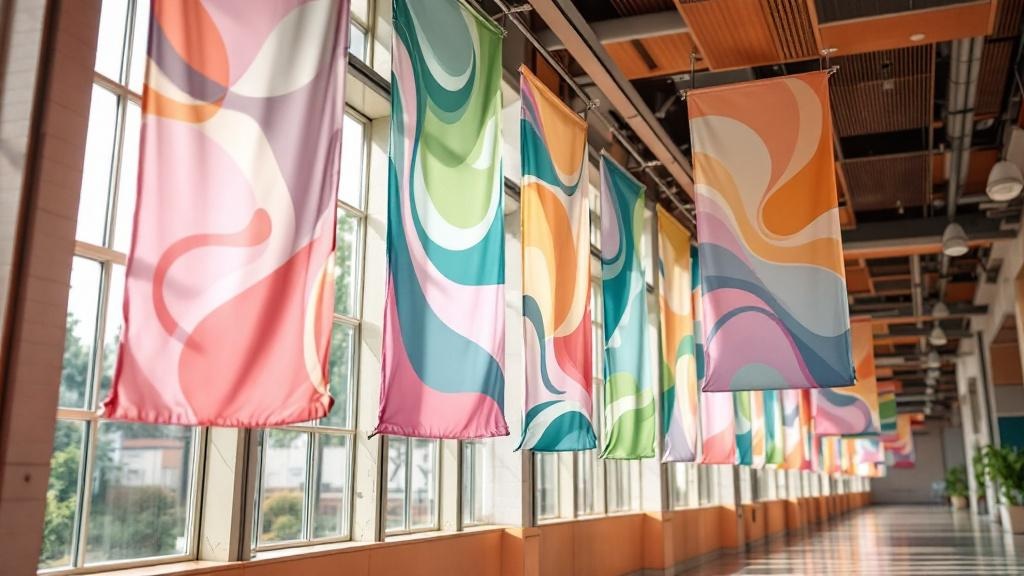
Movement and Flow in Modern Logos
Static designs feel outdated in our animated world. Today’s best identities suggest motion even when still. Curved lines imply speed and grace. Overlapping forms create depth and energy. These techniques mirror athletic movement beautifully.
Digital platforms demand flexible visual systems now. Logos must animate smoothly for video content. They need to work as tiny app icons too. Therefore, simple core shapes with complex variations win out. This balance requires serious skill.
The Future of Event Visual Identity
Where does sports branding go from here? Several trends point toward interesting directions. First, personalization will increase dramatically. Fans may see customized versions of official designs soon. Technology makes this possible at massive scale.
Second, motion will matter even more. Static logos will become rare in major events. Everything will breathe and move constantly. This shift requires new skills from design teams. Traditional print-focused thinking won’t survive this change.
Third, sustainability will shape material choices. Physical applications must consider environmental impact. Temporary structures need recyclable graphics. Explore more creative trends at KREAblog. These constraints often spark better creative solutions.
What Designers Can Learn
Major event branding offers lessons for every creative professional. Simplicity beats complexity when reaching huge audiences. Cultural sensitivity matters more than personal taste. And systems thinking trumps single-image solutions every time.
However, the biggest lesson might be patience. Great identities take years to develop properly. They survive countless revisions and tests. The best designers embrace this long process fully. Rushing produces forgettable work that fails under pressure.
Young designers should study past successes carefully. What made certain identities memorable? Why did others fade quickly? Visit KREAblog for ongoing design analysis. These questions reveal timeless principles behind trendy surfaces.
Global events will keep needing bold visual identities. The stakes will only grow higher over time. Designers who understand both art and strategy will thrive. Those who ignore cultural context will struggle badly.
This article is for informational purposes only.


