


Most people never think about where screen fonts come from. But the very first screen font ever designed for digital display changed everything — from how we read news to how we buy things online. It was a quiet revolution. Nobody threw a party. But the world of design was never quite the same after it happened.
The Screen Font That Started It All
Before screen fonts existed, designers simply borrowed print fonts. They pushed them onto monitors and hoped for the best. The results were blurry, jagged, and honestly pretty painful to read. Early computer screens had very low resolution. Print fonts were built for sharp ink on paper — not for glowing grids of pixels.
In 1984, Susan Kare changed that. She was a young designer working at Apple. Steve Jobs had hired her to give the original Macintosh a personality. He wanted it to feel warm and human. Kare’s job was to design the icons — but she also ended up designing something far more lasting.
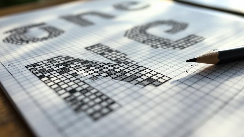
Drawing Letters on Graph Paper
Kare designed her fonts by hand on graph paper. Each square represented one pixel. She treated the screen like a tiny mosaic. Every letter had to look clean at extremely small sizes. This was a completely new way of thinking about type design. It had never been done before at this level of care.
She created Chicago, Geneva, and Monaco — all original screen fonts. Chicago became the face of the Macintosh menu bar. It stayed there for nearly two decades. That is a remarkable run for any typeface. Most fonts disappear quietly. Chicago became iconic.
Why Pixel Grids Changed Typography
Kare’s approach introduced a brand new constraint. Every curve had to be faked using straight pixel edges. Diagonal lines looked like staircases. Designers had to trick the human eye into seeing smooth shapes. This wasn’t just design — it was visual psychology. It pushed typography into new territory. Suddenly, legibility at tiny sizes became its own art form.
What Made Screen Font Design So Different
Designing a screen font was nothing like designing for print. Print designers could rely on curves, ink spread, and paper texture. Screen designers had a rigid pixel grid and nothing else. There was no room for subtlety. Either a pixel was on or it was off. That brutal simplicity forced a completely new kind of creativity.
At KREAblog, we love stories like this. The best design breakthroughs usually come from impossible constraints. Kare had very few pixels to work with. So she made every single pixel matter. That discipline produced fonts that felt alive even on dim, low-contrast screens.
The Bitmap Era Nobody Talks About
Kare’s fonts were bitmap fonts. That means they were built pixel by pixel at fixed sizes. If you scaled them up, they turned into chunky blocks. There was no flexibility. But within their intended size, they were razor sharp. This was actually a strength. Consistency mattered more than flexibility in early computing.
Later, scalable vector fonts arrived and bitmap fonts faded away. But they left behind something important. They proved that screens needed their own visual language. You couldn’t just copy print. The screen was a different medium. It needed fonts born from its own logic.
The Surprising Names Behind the Fonts
Here is something most people don’t know. Susan Kare named her fonts after cities. Chicago. Geneva. Monaco. Cairo. Athens. She was inspired by city maps near the Apple office. The names stuck. Later, Apple continued the tradition with fonts like New York and San Francisco. That naming system traces directly back to Kare’s original instinct. One designer’s small habit became a lasting brand decision.
Why This First Still Matters Today
Every font you read on your phone right now carries DNA from that 1984 moment. Modern screen fonts like San Francisco, Roboto, and Segoe UI all wrestle with the same core problem Kare solved. How do you make letters look clean and readable on a glowing screen? The tools are far more advanced now. But the question is still the same.
High-resolution displays changed the rules significantly. Retina screens pack so many pixels that the old bitmap problem mostly disappeared. But the philosophy Kare introduced never left. Design for the medium. Don’t borrow from print. Build something native to the screen. That idea still drives the best type designers working today.
The Legacy Nobody Credits Properly
Susan Kare rarely gets mentioned alongside famous graphic designers. That is a real shame. She did something genuinely new. She created a design language for a medium that had no design language yet. That is an incredibly rare achievement. Most designers refine what already exists. Kare had to invent from scratch. Her work sits inside billions of devices and almost nobody knows her name.
The next time your phone’s font looks sharp and clean, remember that story. It started with a young designer, a sheet of graph paper, and a strict grid of tiny squares. Not every world’s first comes with a dramatic announcement. Some of them just quietly show up on a screen one morning and change everything.
This article is for informational purposes only.


