

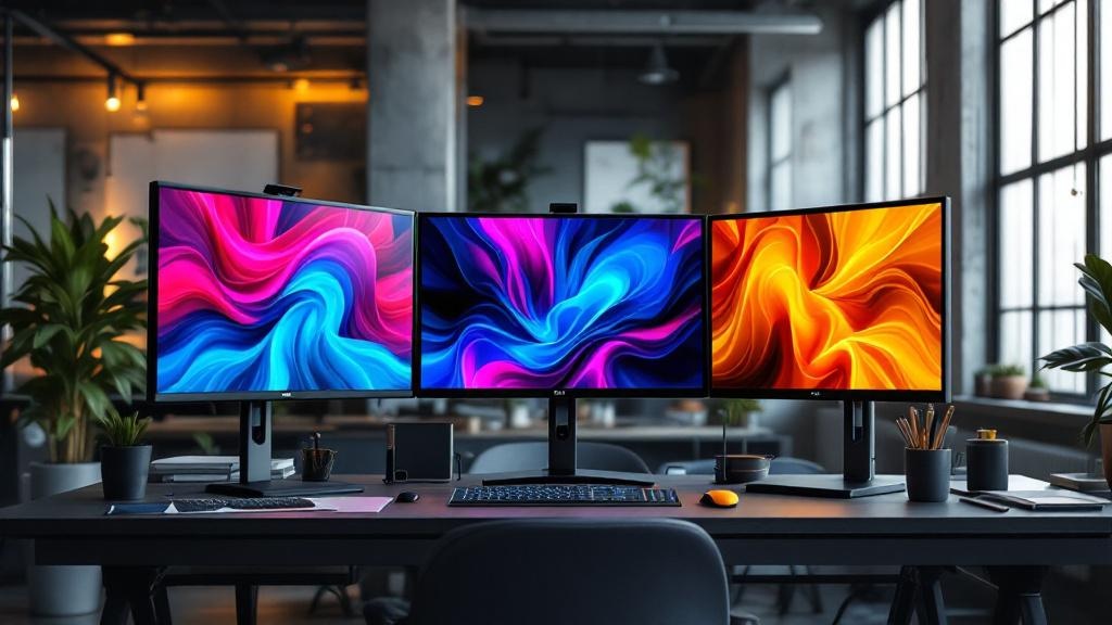
The quiet rebellion against minimalism has officially arrived. Saturated color now dominates digital brand identities, and frankly, it’s about time. For years, designers played it safe with muted palettes and endless white space. However, the most memorable brand refreshes today embrace rich, unapologetic hues that demand attention.
This shift isn’t random aesthetic chaos. It represents a calculated response to digital fatigue and screen saturation. When users scroll through thousands of images daily, subtlety becomes invisibility. Brands recognize this reality and respond accordingly.
Why Saturated Color Dominates Modern Brand Identity
The psychology behind bold color choices runs deeper than mere trend-following. Research consistently shows that saturated hues trigger stronger emotional responses than their muted counterparts. Meanwhile, digital screens render these colors with unprecedented vibrancy. Consequently, designers finally have tools that match their ambitions.
The Death of Safe Palettes
Remember when every tech startup used the same blue gradient? That era feels ancient now. Today’s brands differentiate through chromatic courage rather than conformity. Furthermore, younger audiences actively reject the sanitized aesthetics that dominated the 2010s. They crave visual experiences with personality and punch.
This generational preference reshapes corporate visual strategy. Established companies now compete with digitally-native brands that never learned to fear bold choices. As a result, the entire industry elevates its chromatic ambitions.
Industrial Precision Meets Color Intensity
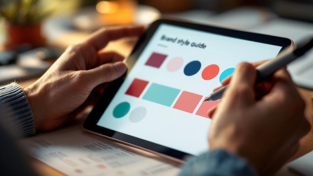
The most successful brand identities balance visual intensity with systematic rigor. Bold colors work best within structured frameworks that maintain consistency. Therefore, design systems become more important as palettes grow bolder. Without clear rules, saturated hues create chaos rather than impact.
Smart designers create detailed specifications for color application. They define exactly when and where each hue appears across digital touchpoints. This discipline transforms potentially overwhelming palettes into coherent visual languages that strengthen brand recognition across platforms.
The Technical Revolution Enabling Bold Design
Display technology finally caught up with designer ambitions. Modern screens reproduce colors that previous generations could only imagine. This technical evolution deserves credit for enabling today’s bold brand expressions. In contrast, designers working a decade ago faced severe limitations.
Wide Color Gamut Changes Everything
P3 and Rec. 2020 color spaces offer exponentially more hues than traditional sRGB. Consequently, designers now access reds that truly pop and greens that genuinely vibrate. These expanded palettes were science fiction just years ago. Today, they’re standard considerations for any serious digital brand strategy.
The challenge lies in graceful degradation. Not every user views content on cutting-edge displays. Therefore, designers must create systems that shine on premium screens while remaining coherent on older devices. This technical balancing act requires both artistry and engineering knowledge.
OLED and Beyond
Self-emissive display technologies render saturated colors with unprecedented punch. Deep blacks make adjacent colors appear even more vivid. Meanwhile, HDR capabilities add luminance ranges that create genuinely new visual experiences. Brands ignoring these capabilities miss significant opportunities.
Forward-thinking designers already incorporate display-specific optimizations into their brand systems. They understand that a color appearing one way on an iPhone looks different on a budget Android device. This awareness separates amateur efforts from professional brand development.
Strategic Applications That Actually Work
Bold color alone doesn’t guarantee brand success. Strategic application separates memorable identities from forgettable ones. The most effective approaches use saturation purposefully rather than uniformly. For example, accent colors draw attention to specific elements while neutral backgrounds provide visual rest.
User experience considerations must guide chromatic decisions. Highly saturated interfaces can cause genuine eye strain during extended use. Therefore, smart designers reserve their boldest choices for moments of maximum impact. They balance visual excitement with practical usability concerns.
Motion design amplifies color impact significantly. Transitions between saturated hues create dynamic experiences impossible in static media. However, animation timing requires careful calibration. Too fast feels jarring; too slow loses momentum. The sweet spot creates satisfying visual rhythms that reinforce brand personality.
The Contrarian View: Boldness Backlash Incoming
Here’s an unpopular prediction: this saturated moment won’t last forever. Design history shows clear cyclical patterns. Maximalism inevitably triggers minimalist responses, and vice versa. Today’s bold palettes will eventually feel dated and overworked.
The smartest brands prepare for this inevitability. They build flexible systems that adapt to shifting aesthetic preferences. Their core identities remain recognizable even as specific color applications evolve. This long-term thinking distinguishes enduring brands from trendy ones that require constant reinvention.
Cultural context also matters enormously. Color meanings vary dramatically across global markets. A hue signaling luxury in one culture might suggest danger in another. International brands must navigate these complexities carefully. Failing to consider cultural associations can undermine otherwise excellent design strategy work.
Ultimately, saturated color represents a tool rather than a destination. The brands winning today wield this tool with intention and restraint. They understand that impact requires context. Endless boldness becomes its own form of monotony. The future belongs to designers who balance chromatic courage with strategic wisdom.
This article is for informational purposes only.


